To redesign and update the e-commerce website for Finish Line, aligning the new digital experience with the company’s values and the online behaviors of their customers.
STUDY GOALS
There were three goals of this UX research study.
Why are people completing or not completing purchases?
Is the site addressing its e-commerce needs as well as its “resneakerization” cultural mentality?
Is there enough information present for users to make a purchase decision?
QUALITATIVE AND QUANTITATIVE USABILITY TESTING
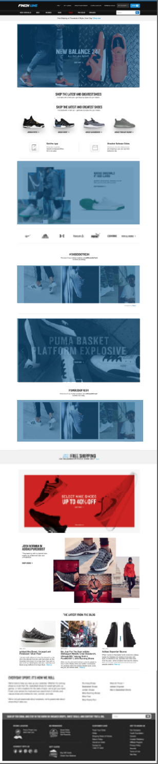
I set up the usability test for the Finish Line’s e-commerce site, the website sells a large number of shoe brands and caters to people across the United States.
I initiated the study by meeting with the creative, brand, development, and executive teams. I did my own heuristic analysis but this meeting amplified the need for new ways of displaying the homepage to users. My heuristic analysis revealed potential usability issues and gave me some insight into the client’s goals and needs.
The usability study consisted of a preliminary interview, a series of cards sorts, task prompts, ethnographic documentation, and finally a post study interview. The usability study focused one overarching assignment, improving the homepage experience where customers saw the newest shoes available from different brands.
The session ran for about a 40 minutes. I facilitated these interactive interviews and acted as note-taker.
CRAFTING THE STUDY
Content Audit: The content inventory required that I sit down with my team and look at every single page on the Finish Line website. By looking at the whole site, I was able to create a site map and corresponding content spread sheets and look at the content of the site as a whole. I was able ask, “what is all of the content?” “What content do we need to accomplish our users needs with the redesign?” “What don’t we need?” “Where does the content need to improve?”
While conducting this audit I realized the site had two main stakeholders. The brands that displayed their shoes on different parts of the website, and the customers who made purchases directly from the FinishLine site.
I realized the site needed a more dynamic way to display content on its most polar page, both for the brands that wanted to display there and the customers who came to visit the site.
Site structure: I created a number of journey maps for each of FinishLine’s stakeholders to demonstrate the steps each had to take in order to accomplish a task. I used paper and my team as tools to conduct a card sort for the purposes of finding the highest priorities for the users.
Competitive Review: I spent a lot of time looking at direct and indirect ecommerce competitor sites. One I really loved was Chico’s – for its visual simplicity, large number of locations for individual brand images, and the ability for the site to balance ecommerce with culture pieces.
Collaborative, remote “sketching” workshops: After several inter-department sketching sessions, I created basic wireframes in Sketch to demonstrate how user goals translated into physical design.
Wireframes and prototypes: I used InVision to demonstrate what the updated features would look like to the executives on the FinishLine board.
MY ROLE - UX Designer and Researcher
On a team of project managers and designers, I led the effort to evolve the website through a few different roles:
• Improved team communication through increased conversation, designed inter-department info graphics and white boarding sessions.
• Led design team meetings and helped facilitate rapid prototyping sketching sessions, persona creation, and stakeholder priority lists.
• Did UX research with users to assess what was most important to them in creating a website that they would make purchases from and rely on for “shoe culture” authority.
• Encouraged prototyping at every interval of the design process. Explored Marvel as well as Invision and Zeplin as resources for usability tests and internal design communication.
• Wrote detailed specs and helped mentor the rest of the team on writing and thinking through scenarios and states.
• Helped manage and plan team workflow from the initiation of the project to its inception. I used a combination of Jira and Basecamp for the organization of this process.
DESIGN RECOMMENDATIONS
Based on the data that I collected, I recommended that Finish Line provide more interaction into their website. Specifically, each category on the homepage could use more space to display their beautiful content and the information around the product. A few months after I made this report, Finish Line updated their home page to include several “scroll” screens that could be easily updated and include content from multiple brands and “sneakerization” culture.